OTF Data
case study
Problem
On May 25, 2022, I (finally) hit 300 OrangeTheory classes. I wanted to analyze the data visually. I analyzed my workout data for a programming class in the summer of 2021 with some visuals but wanted to use the skills I gained in the Tableau class.
Technology Used
- Tableau
- Excel
I have been collecting my workout data in an Excel spreadsheet for a long time. I tried using Excel to create some interesting charts, but was never satisfied with how they looked.
During the Spring 2022 semester, I took a Tableau class and was able to use my data to create these charts for a final project.
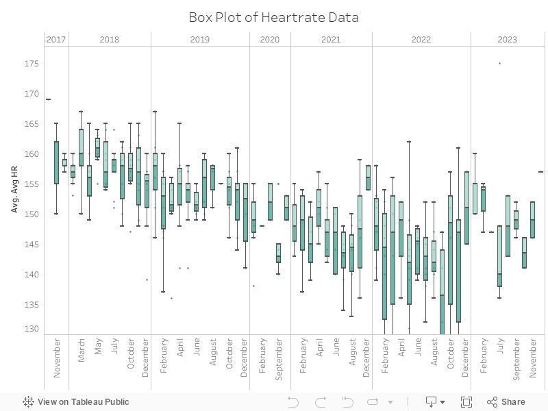
Box Plot
I have found box plots to be interesting as they show a variety of statistics in a data set. For my OTF data, I found it an interesting way to see the variation in my average heart rate during the hour-long workout from month to month over time.
Box Plots are a standardized way of displaying the data based on the five-number summary which includes minimum, maximum, median, and first and third quartiles.
Minimum: the lowest data point in the data set excluding any outliers
Maximum: The highest data point in the data set excluding any outliers
Median: The middle value in the data set
First Quartile: Also known as the lower the median of the lower half of the dataset.
Third Quartile: Also known as the upper quartile the median of the upper half of the dataset.
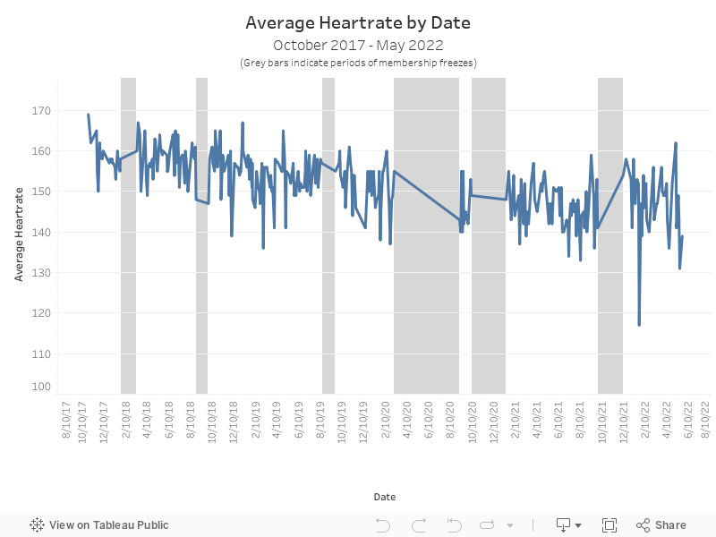
Scatter/line Plot
This is a Tableau version of a visualization I did in a previous class. But this one has the added benefit of including more information about that specific workout when you hover on the line. Including the average heart rate, type of class it was (2G or 3G), the Focus of the class (Endurance, Strength, Power or ESP), the number of Splat Points earned, total calories burned, and any notes I made about that specific workout.
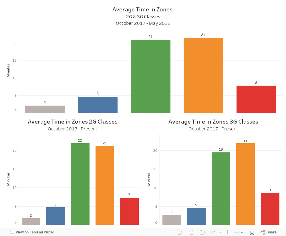
Bar Chart Dashboard
One of the suprising things I discovered was that there is not much of a difference in the time I spend in the five zones, between the two different types of classes. I would have guessed that during a 3G class I would have quite a bit more time in the Red and Orange Zones, but that is not the case. However, now that the templates are different, It would be interesting to see if that changes.